LOGOMARK
When they came to Design by Jo, Armed to Paint had a hand drawn image as their logo. And though they knew that they needed something cleaner and more versatile to use on marketing materials, they also loved the concept of the octopus as a mascot.
Knowing that they didn't want to lose the artistic vibe that their drawing presented, we set out to design something fresh, fun and clean, that stayed true to the playful side of the brand.
OLD
NEW


POSTCARDS
Here at Design by Jo, we always try to find new ways to surprise and delight our customers. Like this suede touch, raised spot UV postcard for Armed to Paint. Not only did we help make their vision a reality with these lux marketing pieces, but as a bonus we also found them the world’s cutest delivery boi. To be honest, we’re having a little trouble training him to deliver the postcards, and not just eat them… but that’s business right? Always room to grow…


BUSINESS CARDS
Helpful tentacles reach around the card to add an element of fun to what would otherwise be relatively basic business cards. The wrapping tentacle elements will carry through to other products, like unique yard signs and playful shirt designs.

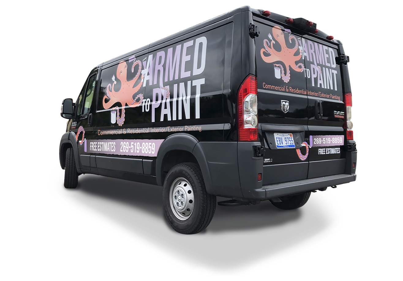
VEHICLE WRAP DESIGN/MOCKUP
Reversing the logo was the perfect choice for the Armed to Paint Van. Not satisfied with simply slapping the logo on the side, we used the same tentacle elements popping out of hiding places to give it character.


COLOR PALETTE
The Armed to Paint brand colors needed to be as vibrant and alive as the crew themselves. We drew inspiration directly from nature, and then softened it to a more playful tone, while still keeping it sharp enough to pop!


