WHIRLPOOL
Brand Identity
Moodboards
Design Project Management
Event Posters & Visuals
Experiential Brand Language
Icon Design
Brand Guidebooks Content
Pattern Design
Although Whirlpool Corporation already has many teams of in-house designers, Design by Jo fulfills a unique need. With availability to focus full energy on a single project at a time, or to work cross functionally across multiple global design teams at once, helping them to function as a whole. Whether it's assuming a role for a project already underway, or project managing the visuals for their annual Board of Directors meeting. Design by Jo creates functional art, information graphics, and communication spreads that help the Whirlpool team move projects and ideas forward.
EXPERIENTIAL BRAND LANGUAGE
Moodboards were created, using images curated through consumer studies for each brand. The moodboards were designed to be hung in global brand studios, so that industrial designers in other countries who don’t get to see the physical product can still get a feel for the brand language as they begin each new project.
BRAND GUIDELINE CURATION
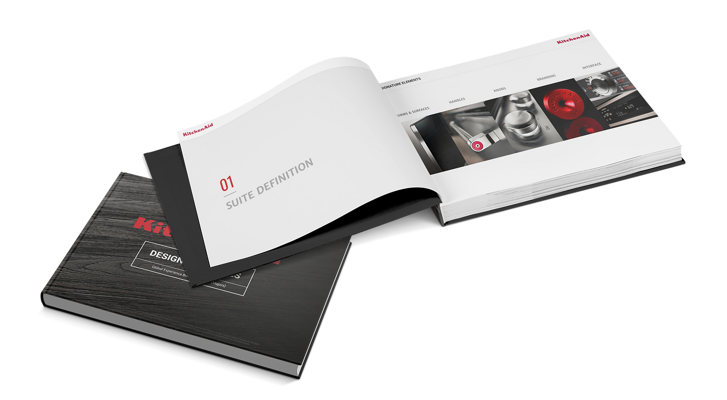
These guidelines cover everything from Brand Attributes to Industrial Design Elements to Color, Finish & Materials. In this case, my role was not to create the rules of the brand, but rather to curate information from hundreds of sources. From consumer studies to industrial designers, platform leads & GCD Design directors, I talked to them all. The photo below is a mockup representation of a digital product.

I then translated the gathered information to the guidebooks, either confirming previous information as still correct, updating outdated information, images and drawings, or filling in gaps where no information had yet been provided. Engineering specs were simplified into basic line drawings that capture the essence of the brand for the next round of designers to follow.
I went through all of the brands carefully, and created a system to be sure that they all covered the same crucial categories of information, then updated each brand accordingly.

ICON STYLE EXPLORATION
Brands regularly need to be refreshed to stay relevant.
This includes icon forms, details, dimension & style.
INSPIRATION

Wedge Style
Emboss Style
Deboss Style
Tooling Style
EXECUTION
ICON STYLING BETWEEN BRANDS

Icons between family brands need to be similar as far as content goes, but still have to follow the distinct brand style. They also need to be available in 3 different sizes for screen uses, and with each resize, modifications need to be made to insure there is never a gap smaller than .3mm, which could create a bright spot on screen.
9mm
7mm
5mm
9mm
7mm
5mm

VIEW MORE WORK
They say a picture is worth a thousand words, and when it comes to branding, we have plenty of those...So we just let our work speak for itself.


At Choice Coaching
Brand Identity, personal branding, art direction, custom website design & high impact business cards for a life coach

Jen Mauerman
Career Success Coach
CASE STUDY COMING SOON
CASE STUDY COMING SOON


